
HOW-TO
Shooting for the Print — Notes from Someone Who Sells Them
When the form in which you hand a photograph to someone changes from a screen to a sheet of paper, several of the decisions you make while shooting change with it. I photograph the flower landscapes of Japan and sell them as silver-halide prints on FUJICOLOR's finest photographic paper. This article sets out what I have learned doing that. It is not about making good photographs; it is about photographs that do not break when you put them on paper.
Paper has proportions of its own
This is the first thing you run into. The aspect ratio your camera produces and the aspect ratio of the paper do not match.
Most of my work is shot at 3:2, a ratio of 1.50, because that is the shape of a full-frame sensor. Photographic paper, meanwhile, comes in dimensions settled by an entirely separate lineage. So when you print a 3:2 photograph to fill the sheet, the ends of the long edge are cut off in proportion to how far the paper's ratio sits from 1.50.
Put into numbers, it is a bigger matter than you would think. Across the papers we offer, printing a 3:2 frame to fill the sheet crops the long edge by about 0.2% on 6-cut wide (ratio 1.50), which is effectively nothing; about 4% on 4-cut wide (1.44); about 6% on A4 (1.41); about 8% on the A3 equivalent (1.38). And then about 17% on 6-cut (1.25), and about 20% on 4-cut (1.20). The closer the sheet comes to a square, the more of the edge disappears. Every size is listed in the size-by-size guide.
The same photograph can lose a fifth
of its width, depending on the paper.
The important thing here is that being cropped is not in itself bad. If the composition still holds after the crop, nothing has gone wrong. Trouble only arises when you have put something you cannot do without at the very edge of the frame.
More on technique and gear
The same tools, the same light. Read on and the craft joins up.
So do not put anything important at the edge
There is really only one thing you can do at the moment of shooting: shoot the outermost few per cent of the frame as margin the picture can survive without.
This is slightly different from "stand back and leave yourself room". Stand back too far and the subject shrinks and the photograph loses its force. The point is rather to arrange things from the outside inward, in order of how little their meaning breaks when cut. Horizon, sky, foreground ground, shadow — put those at the edge, and keep the subject, and whatever makes the subject the subject (where a gaze is directed, two things that answer one another, the direction something extends), further in.
When our own wording says that each piece is composed and cropped so that it works as a photograph at any size, this is the work it refers to. After shooting, I look at whether it holds across every paper size we print and decide. Leaving a little margin at the moment of shooting makes that work far easier.
And still there is one that cannot be cut
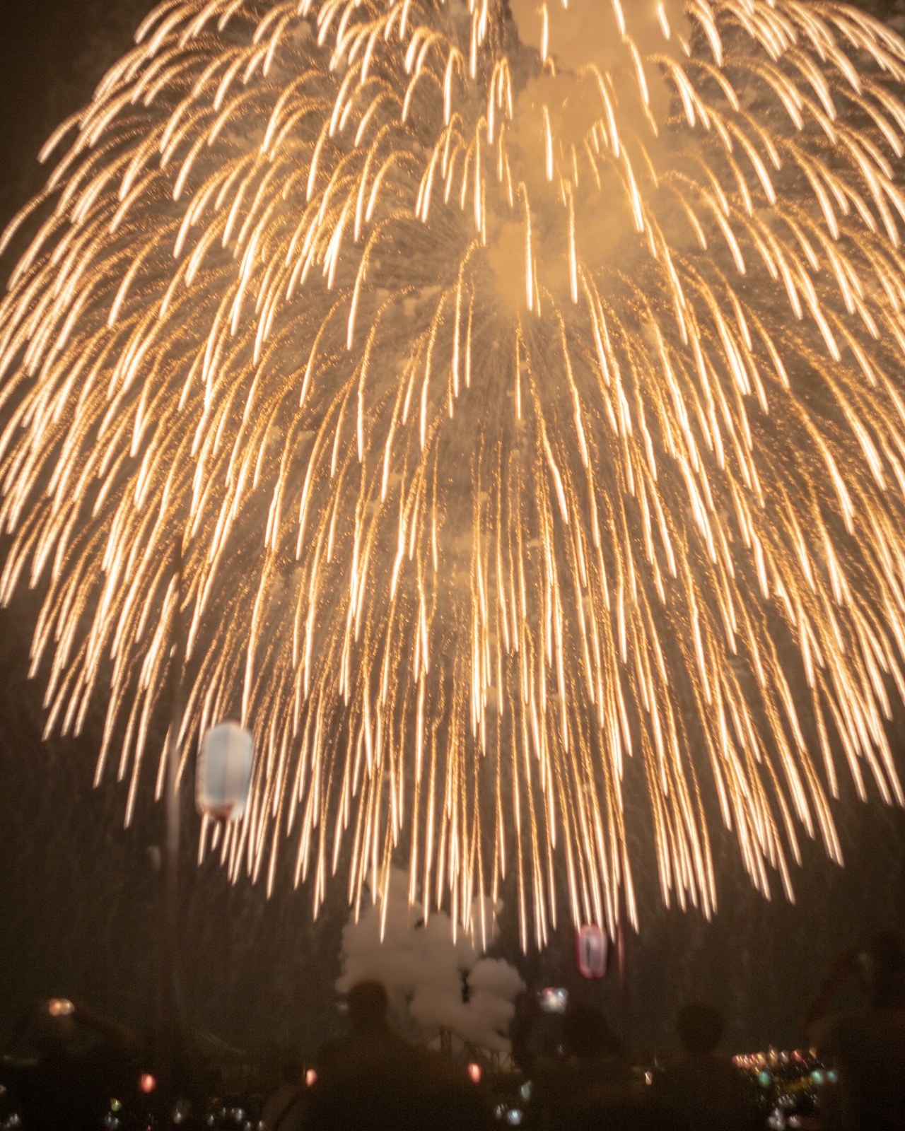
Even so, photographs come along that need every last edge. Among the prints on sale there is one sold in 6-cut wide only: A Crimson Night, a Single Thread of Light.
The night sky over Nagaoka. Within crimson and orange smoke filling the whole frame, a strong white blossom opens at the upper right, and directly beneath it two fine threads of light run straight up. Those are the trails of the shells climbing from the ground into the night sky. The left of the frame stays dark and quiet as margin, and along the very bottom a faint bleed of town lights. And down in the lower left there is a small crescent moon.
In this one, every corner of the frame, edge to edge, is part of how the photograph breathes. Cut the bottom and the town lights vanish and you can no longer tell where the shells rose from; cut the top and the position of the blossom shifts and the length of the trails stops being readable. The dark margin on the left is needed too, as quiet.
And that crescent moon, sitting where it sits, is the first thing a crop takes away. The very fact that there was a moon out on the night of the fireworks would be gone from the frame. I think of the moon as part of this photograph too, and it is the biggest single reason the piece is offered in 6-cut wide only.
So for this piece alone we offer only 6-cut wide, the size that prints a 3:2 frame almost entirely uncropped. Which is to say we threw away five of the six sizes. In terms of sales that is plainly a losing decision, but selling it on paper where the photograph does not hold together is probably a bigger loss. (A digital version, on which you can see the whole frame on screen, is also available.)
I have written about that night in the Nagaoka Festival Grand Fireworks, and about how to shoot it in How to Photograph Fireworks.
On paper, a blown highlight becomes nothing at all
This, I think, is the largest difference between the screen and the paper.
A monitor emits its own light, so even a blown area reads as a dazzling white with a certain presence. Paper does not emit light. You see only reflected light, so a blown area becomes the white of the photographic paper itself — paper with nothing printed on it. Not dazzle, but a hole.
A silver-halide print fixes colour through light and a chemical reaction. Where the frame has blown, there is nothing to fix in the first place. A sky you thought of on screen as a little bright but atmospheric opens up on paper as a white void — that, I think, is the biggest surprise the first time you send work out to be printed.
So if you are shooting for the print, you protect the highlights more carefully still. Preventing the sky from blowing out at the moment of exposure is covered in Choosing a Graduated ND, and managing highlights under illumination in Tripods and Night Photography. Shadows, by contrast, hold on better on paper: blocked black reads naturally as black, so the rule of thumb when in doubt, expose a little darker grows one degree stronger once paper is the destination.
Between the monitor and the paper
There is one more difference you cannot get around. A monitor makes colour by adding light; paper makes colour by subtracting it. The principles are opposites, so the colours that looked most vivid on screen are exactly the ones paper struggles to reach.
The gap shows up most in highly saturated blues and greens. A photograph you have pushed on screen to the deepest blue it will take can come out on paper calmer than you expected. That is not a failure; it is simply how it works. The remedy is straightforward: stop while you still feel there is one more step to go. Saturation and contrast pushed to their limit leave no room to carry over onto paper.
And a word about your surroundings. Finish your work with the monitor turned up bright and you fall into the habit of finishing everything too dark. Paper does not light itself and is seen under room lighting, so it is safer to settle on a brightness that holds up when viewed in a well-lit room.
The bigger the print, the bigger the flaws
It sounds obvious, and yet it is surprisingly often overlooked. In the same photograph, things you never noticed at postcard size become plain once it is enlarged to the A3 equivalent: camera shake, a slight miss in focus, high-ISO noise, and smearing towards the corners.
This is not an argument for shooting perfectly. Quite the opposite: it is that the size at which a given photograph is really being tested differs from photograph to photograph. Work whose subject is detail wants to be large; work whose subject is a field of air or colour holds together small. Photographs I have made with an old lens, or a frame with its outlines dissolved by intentional camera movement, are not pictures that show themselves through resolution in the first place. Work like that changes far less in impression as the size changes.
Work backwards from where it will hang
The last point sits a little away from shooting itself. A print is only finished once it is on a wall. So the final criterion is not whether it is well photographed but whether it holds up on that wall.
A sense of size comes quicker from familiar objects than from numbers. A4 is the same as a sheet of copier paper; the A3 equivalent is about half a newspaper. Against a wall, A4 is modest, and presence starts at 4-cut and above. A frame adds another step to the outside dimensions, so measuring the wall against the frame's outer size is the surest approach. Inner and outer dimensions for each size are collected in Choosing a Frame.
And deciding where it will hang first feeds back into how you shoot. A wide wall calls for landscape format; the narrow wall of a staircase or beside a pillar calls for portrait. Look through the viewfinder while thinking about where this will hang and the way you leave margin changes. I called this a piece about photographs that are sold, but in the end it is simply about making a photograph that will hang in someone's room for a year, or for ten.
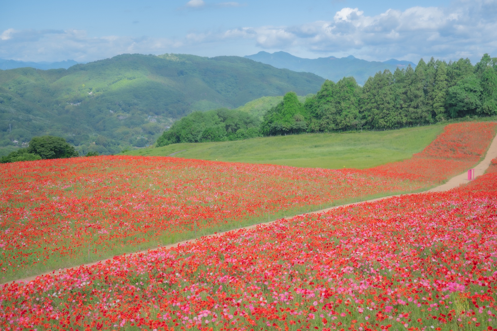
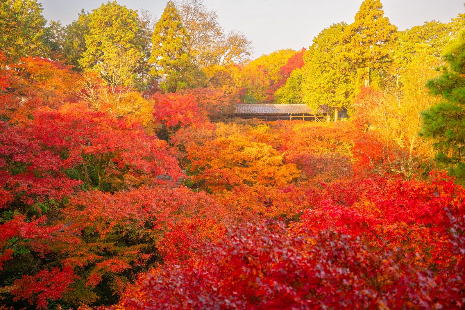
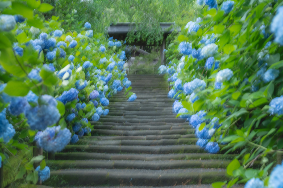
Three photographs that had it out with paper proportions
One that needed every edge, one that works displayed large, and one made by dissolving the outlines. Delivered as silver-halide prints on FUJICOLOR's finest photographic paper.
The developing approach behind the photographs in this article is gathered into 30 presets for Lightroom / Camera Raw ($15.00 — a ZIP download straight after purchase).
View the presets →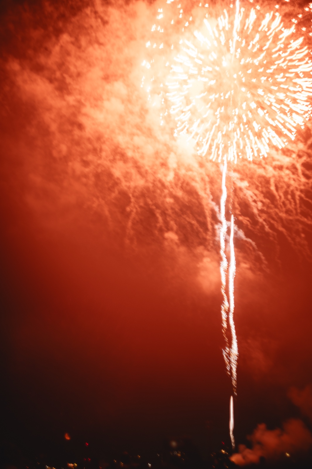
Each print is finished by hand at Aoyagi Photo Kogeisha, founded in 1952, as a silver-halide print on genuine FUJICOLOR top-grade professional photographic paper. Six sizes are offered for international delivery, and for each photograph we make available the sizes at which it holds together.
🖼️ Choosing a frame (with inner and outer dimensions)
💾 A digital download is also available ($4.00 each). Bundles cost less: 3 for $10.20, 5 for $15.00 ($3.00 each) — mix any photographs you like.
View A Crimson Night, a Single Thread of Light →